When you land on a website, what’s the first thing you notice?
Chances are, it’s not the backend code or the hosting environment; it’s the design. Typography, colour schemes, layout, and visual hierarchy all come together to form a first impression.
For businesses in Canada and beyond, these design choices are not just about looking good; they play a high-priority role in building user trust and guiding conversions.
While beauty in web design can amplify a website’s attractiveness, it should not override productive messaging and strategic design elements.
Think of your website as your digital storefront; presentation matters.
A clean, bold, and modern design sends the message: this brand is professional, consistent, and trustworthy. Consistent branding through visual identity, especially with colour schemes, is the secret to establishing trust and recognition.
Let’s dive into how bold typography and colour psychology help modern websites stand out and strengthen trust with their audiences!
- What Is Modern Design?
- Colour Psychology in Web Design
- Design Principles That Build Trust
- Developing a Design Strategy
- Future Trends in Bold Typography & Colour
- Measuring Success: When Design Drives Conversions

What Is Modern Design?
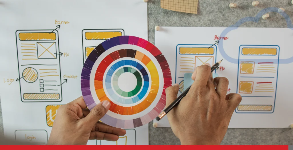
Modern web design is more than just aesthetics; it’s a strategic blend of art and science that shapes how users interact with your website. Today’s web designers must investigate the fundamentals of colour psychology, typography, and layout to create websites that not only look stunning but also drive user engagement and achieve business goals.
A successful website does three things fast:
- Grabs attention at first glance
- Communicates brand identity clearly.
- Guides visitors with a smooth, consistent experience.
When you explore the world of modern websites, you’ll notice that every element, from bold typography to carefully chosen colour schemes, works together to create a memorable impression.
The layout must be intuitive, the colours must evoke the right emotions, and the typography must be both readable and on-brand.
The Impact of Bold Website Typography on User Engagement
Typography is more than just picking a pretty font. It influences how people feel, what they remember, and whether they trust your brand.
Modern web design has embraced bold website typography as a way to grab attention and guide behaviour.
- First impressions are lasting: Bold headlines instantly anchor the user’s attention, giving your brand authority and clarity.
- Prioritizing readability: Large, clean, sans-serif fonts are not only contemporary but also build up accessibility for all users.
- Emotional influence: Fonts carry personality. A bold, modern font conveys strength and credibility, while script fonts may feel elegant or artistic.
For example, websites like Apple and Spotify use huge, bold typography to create an interesting and memorable first impression.
These examples show how impactful type choices can guide users and amplify the overall design. Web designers can find inspiration for bold typography by looking at print and graphic design, where creative layouts and type treatments often spark new ideas.
Bold typography isn’t about shouting at your audience. Instead, it’s about setting a clear tone, creating impact, and guiding readers through a visual journey.

Colour Psychology in Web Design
Colours do more than decorate a page; they evoke feelings, spark actions, and even influence purchases. In fact, research shows that people often form impressions of products or brands within 90 seconds, and up to 90% of that is based on colour.
Here’s how different shades affect users:
- Blue & green: calming, trustworthy, professional (good for financial and healthcare industries).
- Yellow & orange: energetic, playful, stimulating; as warmer colours, they create feelings of warmth, welcome, and excitement, often used in food and retail to boost excitement and engagement.
- Red: urgent, bold, passionate (effective for calls-to-action when used sparingly); in Western culture, red is often associated with love, danger, or excitement, but it can have different meanings in other cultures, such as luck and celebration in China.
- Black & white: timeless, minimalist, clean (perfect for luxury or high-end brands); black can hide or evoke emotion, conveying mystery, strength, and protection.
- Pink: associated with love, innocence, vulnerability, and hope; its meaning varies across different cultures and contexts, and it is often used in campaigns like breast cancer awareness to convey empowerment and non-violence.
- Gray: versatile and neutral, gray can symbolize balance, sophistication, or ambiguity; its interpretation depends on cultural and psychological influences.
In Canadian web design, cultural context is also important. Colours can have different meanings and evoke distinct emotions in various cultures, so understanding these differences is necessary for creating effective and culturally sensitive designs.
For example, green often resonates strongly due to Canada’s association with nature and sustainability, but the same colour may have other associations elsewhere.
In Western culture, certain colours like red or black may carry specific symbolism that differs from other regions. The psychological effects of colour, brightness, and saturation influence emotion, are also important to consider, as these properties can shape mood, perception, and user behaviour.
A carefully chosen colour scheme can set the entire mood of a website and influence how long users stay and whether they convert.
The Impact of Cool Colours
Cool colours, such as blue, green, and purple, play a powerful role in web design, influencing how users feel and interact with a website. These hues are often associated with calmness, trust, and professionalism, making them a popular choice for brands that want to build credibility and foster a sense of security.
In colour psychology, blue is known for its ability to inspire confidence and reliability, which is why it’s frequently used in financial, healthcare, and technology websites. Green, on the other hand, is linked to business growth, balance, and nature, making it ideal for brands focused on sustainability or wellness. Purple brings a touch of creativity and luxury, often used by brands that want to stand out with a sense of sophistication.
When web designers incorporate cool colours into their colour schemes, they can create a soothing and inviting atmosphere that encourages users to research further. Cooler colours are also practical for backgrounds and secondary elements, as they add depth without overwhelming the main content.
Ultimately, the strategic use of cool colours helps modern websites convey the right message, support the brand’s identity, and create a positive emotional response that keeps users coming back.

Design Principles That Build Trust
Design isn’t just art; it’s problem-solving. Several timeless design principles come into play in modern web design:
- Balance: Distributing elements evenly to create harmony.
- Contrast: Using colour or typography to highlight important features (such as bold CTAs or promotions).
- White space: Allowing breathing room between elements to maintain clarity and professionalism.
- Consistency: Fonts, colours, and layouts must remain consistent across pages to reinforce brand trust.
When done right, these principles make websites feel intuitive and professional, leaving users confident in your brand’s genuine reliability. Other elements, such as spacing, grid structure, and imagery, also work together with typography and colour to create a cohesive and trustworthy design.
The Power of Visual Hierarchy
Your eye naturally follows specific patterns on a webpage. This concept, known as visual hierarchy, is also critical in guiding users to the right information at the right time.
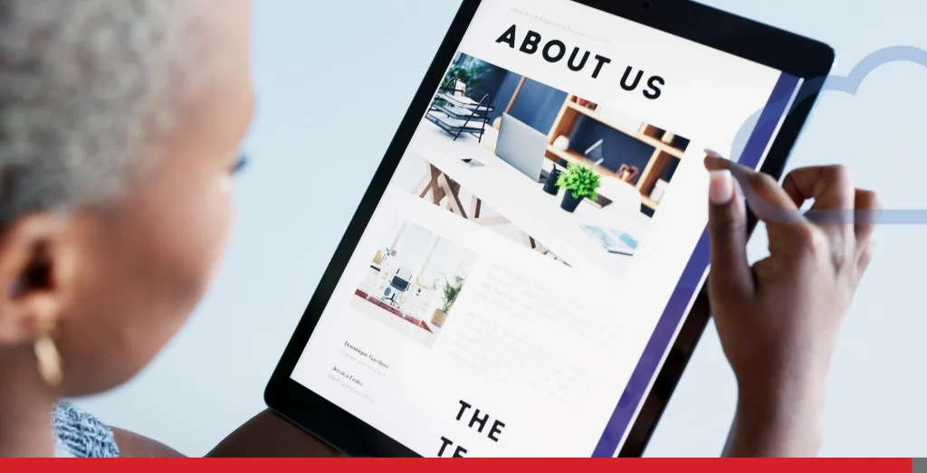
- Hero images set the emotional tone at the top of the page, often featuring a product or person, such as an empowering, joyful image of a woman wearing the product, to evoke emotion and reinforce brand messaging.
- Images throughout the site can be utilized to support visual hierarchy, enhance website aesthetics, convey messages, and improve user engagement and accessibility. Including a ‘view image’ call-to-action or instruction next to visuals encourages users to interact with images for a more detailed view.
- Bold headings organize content into digestible pieces.
- Contrasting buttons and CTAs encourage clicks.
A strong visual hierarchy doesn’t leave visitors guessing; it guides them smoothly through your site, improving both engagement and conversions.
Designing with the Target Audience in Mind
No matter how stylish your website appears, it must resonate with your audience. Consider:
- Demographics: Younger audiences may prefer bold colours and playful typography, while older users often prefer ease of use and legible text.
- Cultural significance: A colour that conveys celebration in one culture might mean caution in another.
- Device use: In Canada, mobile browsing continues to grow, meaning typography and colour choices must adapt to smaller screens.
Factors such as cultural significance and user preferences should be thoroughly explored to make sure the design resonates with the intended audience. User testing and ongoing feedback are also important. After all, the design isn’t for you, it’s for them.
Accessibility: Design for Everyone
Modern web design isn’t complete without accessibility considerations. Canadians increasingly expect inclusive digital experiences aligned with AODA and WCAG standards.
A few necessary accessibility factors include:
- Contrast ratios: Making certain text is readable against background colours.
- Accessible typography: Large, clear fonts that maintain readability across devices.
- Simple navigation: Menus and layouts designed for intuitive use.
- Alt text & labelling: Verifying visuals are accessible to users with assistive technologies.
If you start integrating accessibility into your design decisions, your business will not only comply with standards but also earn trust and loyalty from diverse audiences. Accessible design also signals the quality and reliability of the brand to all users.

Developing a Design Strategy
Every successful website starts with a well-defined design strategy. This process begins by understanding the brand’s identity, business goals, and the needs of the target audience.
Web designers must analyze user behaviour, analyze competitors, and identify what makes the brand unique before making any creative decisions.
The first step is to outline the website’s objectives, whether it’s to increase sales, generate leads, or build brand awareness. From there, designers select a colour scheme and typography that reflect the brand’s personality and resonate with the intended audience. For example, a tech startup might opt for a modern, minimalist layout with bold typography and a cool colour palette, while a children’s brand could use playful fonts and bright, energetic colours.
Throughout the process, collaboration between designers, stakeholders, and developers is central to aligning the visual direction with business objectives.
When taking a strategic approach, web designers can create websites that not only look great but also deliver measurable results.
Integrating Design Elements
Bringing a website to life means seamlessly blending various design elements, typography, colour, imagery, white space, and layout into a cohesive whole. Each element plays a unique role in shaping the user experience and reinforcing the brand’s identity.
- Typography sets the tone for your website, guiding users through content and highlighting major messages. Pairing bold headlines with clean, readable body text confirms clarity and impact. Colour schemes, chosen with colour theory in mind, evoke specific emotions and help organize information through contrast and hierarchy.
- Imagery, such as hero images and background textures, adds depth and visual interest, while white space gives the layout room to breathe and prevents the page from feeling cluttered. The strategic use of high contrast between text and background not only enriches readability but also supports accessibility for users with low vision.
The result is a website that stands out in a crowded digital world, captures the audience’s attention, and delivers a memorable brand experience.

Future Trends in Bold Typography & Colour
Web design is always evolving. Here are some of the trends shaping the future of web design:
- Variable fonts: Adaptive typography that adjusts flawlessly across devices.
- Neumorphism and glassmorphism: Softer, modern visual effects paired with bold typographic contrast.
- Dark mode designs: Gaining popularity for accessibility and lowered eye strain.
- AI-driven personalization: Tailor-made colour schemes and text layouts based on instantaneous user behaviour.
Forward-thinking designers are blending bold website typography with emerging colour psychology trends to create memorable, trustworthy user experiences. Designers are actively exploring new colour schemes, design tools, and strategies to stay ahead of trends and better user engagement.
If you’re curious about more of these trends, we have a full list here: Professional Website Design Trends 2025 to Elevate Your Online Presence.
Testing & Refining
Launching a website is just the beginning; continuous testing and refinement are imperative to ensure lasting success. Web designers use a variety of tools and methods to evaluate how real users interact with the site, from A/B testing different colour combinations and typography to analyzing user behaviour with heatmaps and analytics.
Gathering feedback from a diverse audience helps identify areas where the design can be polished, whether it’s enhancing accessibility, upgrading layout for mobile devices, or adjusting colour schemes for better engagement. Testing also guarantees that the website meets accessibility standards, making it usable for people with different abilities and backgrounds.

Measuring Success: When Design Drives Conversions
A visually stunning website is only successful if it supports your business goals. Designers and business owners should measure success using metrics such as:
- Engagement rates: Are people reading, scrolling, and interacting?
- Conversion rates: Are design-driven CTAs leading to sign-ups or purchases?
- Bounce rates: Are users sticking around or dropping off?
- Accessibility compliance: Is your site usable by all?
Using analytics tools and real user testing, let businesses refine typography choices, colour schemes, and layouts to maximize impact. It’s also important to test and analyze which is the best colour for call-to-action buttons, as choosing the best colour can positively increase user engagement and conversions.
Final Thoughts
At its core, modern web design is about connection. Bold website typography makes sure your words are heard. Colour psychology ensures your brand feels approachable and trustworthy. Together, they create an experience that just looks sharp, feels trustworthy, and drives conversions.
Investing in modern web design principles pays dividends in trust, credibility, and success.
And remember, a great design starts with an unwavering foundation. EasyHosting offers an intuitive website builder solution, packed with tons of templates and elements to play around with and create the bold website design you’re looking for. Give us a call so we can assist you with your website’s needs today!
support@easyhosting.com
Call us: 1-888-390-1210
Want more tips? Check out the EasyHosting blog for the latest trends, strategies, and insider secrets to grow your online business!
FREQUENTLY ASKED QUESTIONS
Why is bold typography so important in modern web design?
Bold typography grabs attention, improves readability, and communicates brand authority. It ensures important messages stand out and creates a strong first impression.
How does colour psychology affect conversions?
Colours influence emotions and actions. For example, blue can build trust, while red can create urgency. A thoughtful palette tailored to your brand and audience boosts engagement and conversions.
Does web design really impact trust?
Yes, visitors often judge a company’s credibility by its website design. A clean, modern look with consistent typography and colours signals professionalism and reliability.
How do I know if my typography and colour scheme work?
User feedback, A/B testing, and analytics can help measure effectiveness. Look at bounce rates, click-through rates, and time on site.
What’s the role of accessibility in typography and colour?
Accessible typography and colour schemes ensure all users, including those with visual impairments, can engage with your website. Compliance with WCAG guidelines is both good practice and increasingly a legal requirement in Canada.


